My Role
I was the UX Lead working to define the experience strategy, perform a content audit, create and present deliverables to stakeholders, design and test the new information architecture, wireframing, prototyping, style guide creation, and usability testing the final responsive design.
The Team: Emery Ullenberg, Jon Tetzlaff, Keith Donnell
The Challenge
Create a responsive site that cleverly explains a highly-complex suite of products and technologies in a way that's both helpful for those not-in-the-know, and useful for expert technologists.
The Research
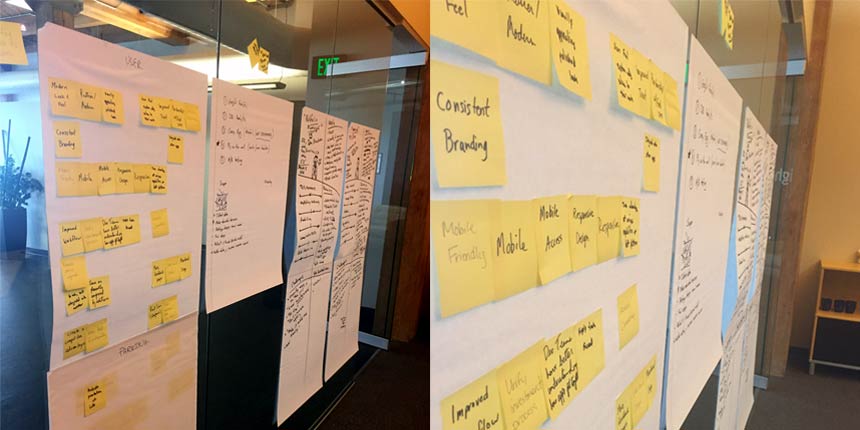
Workshopping
Our initial discovery kickoff with Concurrency had us running goal exploration, persona creation, and stakeholder alignment exercises to construct the initial hypothesis that would drive our research.
Usability Report
My research deliverable came in the form of a Usability Report. I combined the findings from five methodologies which are as followed: three in-person usability tests, six remote tests using usertesting.com, a survey of over 200 users, a heuristic evaluation (performed by myself and two Lightburn employees unfamiliar with the project), and an analysis of their Google Analytics from the past few years.
Poor Method Performance: Our survey results turned out to be pretty bad. On a positive note, we found whom the most active members were and some decent demographic and lifestyle numbers. Even poor results can end up being a useful snapshot of the base, although they should NOT be relied upon for any final decision-making.
92.4% Male – 7.6% Female
24 – 40
Desktop 94% – Mobile 28%
Persona Development
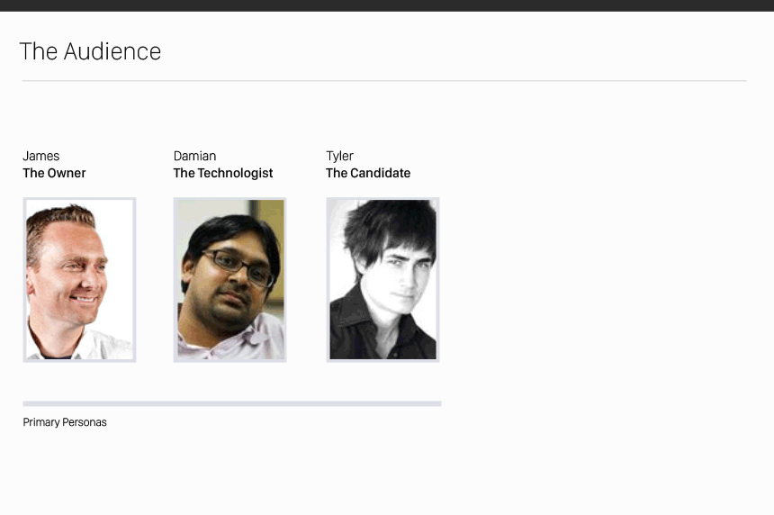
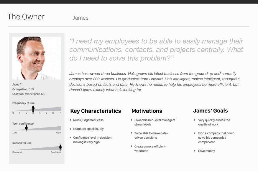
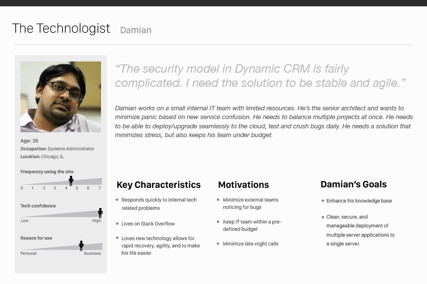
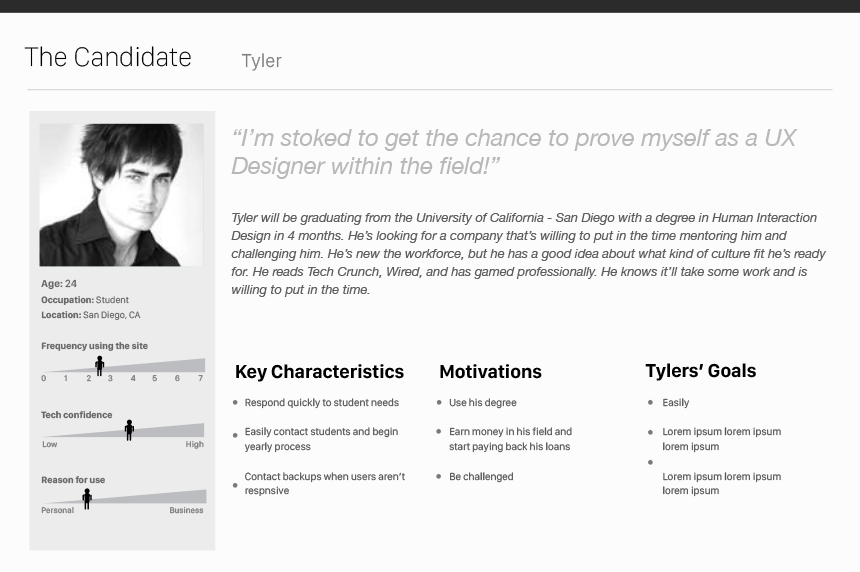
I then created three characters based on the workshop and research: The Owner, The Technologist, and The Candidate.
Concurrency has been growing at a rapid pace, so making sure the site was alluring to possible candidates and graduates was a high-priority. Proving they were thought-leaders, demonstrating large-scale, carefully executed solutions that would stand out to decisions-makers and the incredibly smart people who would have to maintain these systems, was a must.
Content Audit
Before the process of restructuring any site begins, we perform a Content Audit on the current site, app, or system. This allows the team to find large content holes, uncomfortable flows, and realize the scope of the project.
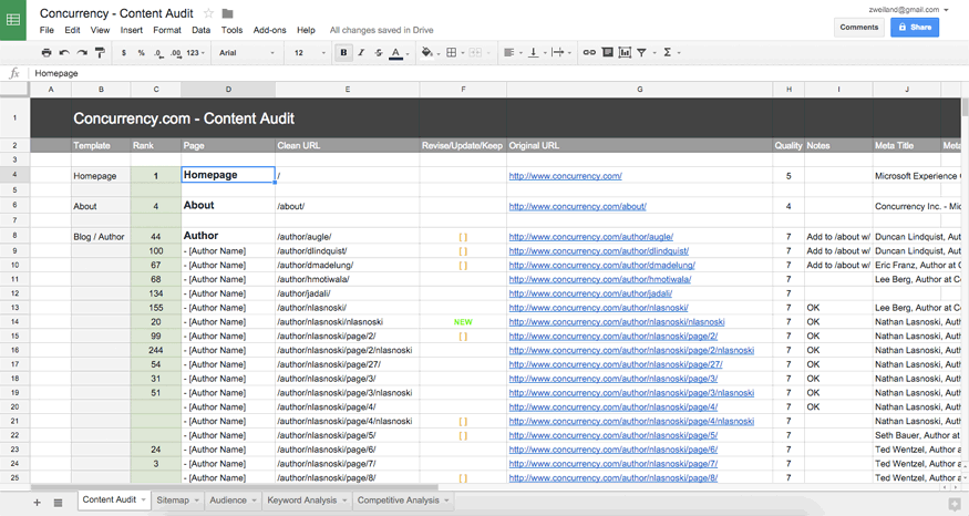
72% of Concurrency's traffic flowed through their Blog
Information Architecture / Sitemap
After mapping the system, running tree tests and card sorts with team members, stakeholders, and current users, we reorganized the structure and visualized the flow. This low-cost deliverable allows everyone to instantly grasp the scope of the project and guides discussions with the engineers and designers.

Wireframing & Prototyping
Usually we'll begin the process with sketches and brainstorming, but because that had all been done earlier in the process, I jumped into UXPin to wire up the sitemap and get a good feel for the flow of the site.
I then iterated through the wireframe templates, redefining areas, and working with the client and content strategist to flesh out content, simplify user flows, and place relevant content to help guide the user.
At this point in the process, we usually begin to add realistic content and copy to help define the voice and tone. It's the only way to really know if the templates will hold up to real-life content.

Visual Design
During the prototyping process, I'll work with the Producer and Designer to help communicate the mood of the site. We use Element Collages and Mood Boards to quickly define and iterate the look and feel without spending too much time on exact templates or pages.
Style Guide
After the client has approved visual design, I'll work with the designer to create Style Guides and Pattern Libraries for each project. The budget will define the complexity and depth of each.
This allows for much easier feature development in the future. Junior designers and front-end developers can then use detailed prototypes, which are much quicker to produce, and style guides to develop new features without a heavy cost to the original designers time.
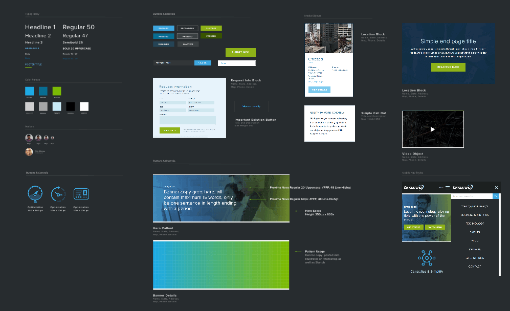
Style Guide for Concurrency
Responsive Design
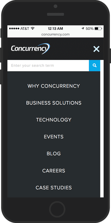
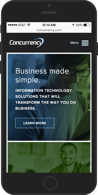
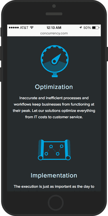
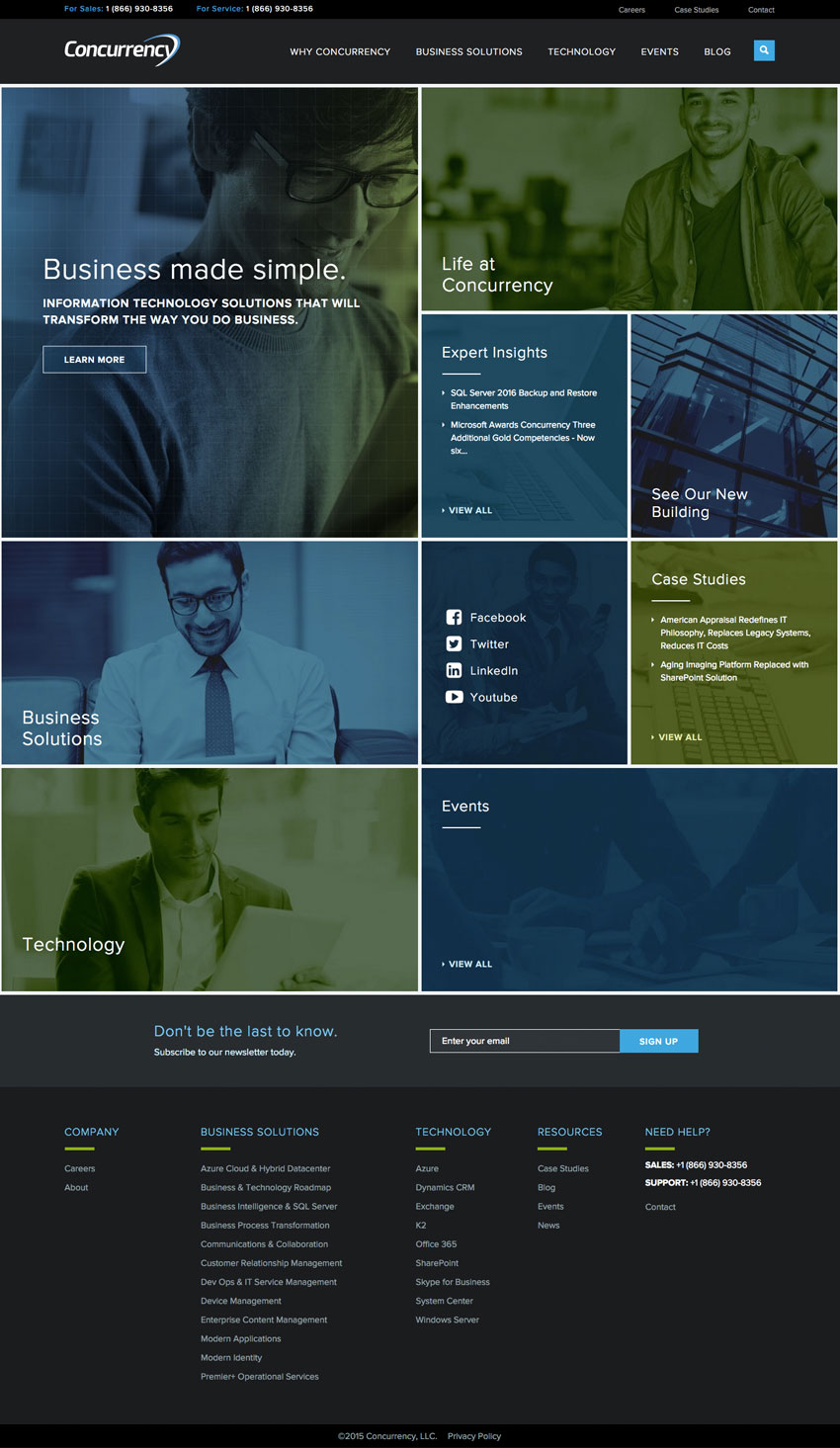
All of our designs need to work across an almost infinite array of screen sizes and pixel-densities. We work through Alpha and Beta cycles to produce functional prototypes that can be tested with real users before launch.

Post-Launch
After launch, it's my job to watch Google Analytics, Crazy Egg, VWO, Optimizely, or any related heat-mapping software to track interactions, scroll patterns, exit points, and goal conversion ratios.
Around two weeks to a month, I'll begin A/B testing certain features of the site and run usability tests, with the goal of collecting quantitative and qualitative data with the aim to focus development time on the second phase or iteration of the site or app.
There are many methods used to obtain real data and drive successful redesigns. This is one version of the process.
Thanks for reading!
