
My Role
I was the Lead UX Researcher for the project. I recruited and surveyed users, ran usability tests, reported key findings, created wireframes and worked with design to iterate and test multiple prototypes of the redesign.
The Team: Emery Ullenberg
The Challenge
Wristband Resources were looking to perform a data-driven refresh of their outdated homepage and navigation to increase sales and conversions.
The Process
Although our brief was at first to simply refresh, we stressed that differentiating ourselves from the competition through data-driven user research and iteration would be a much better strategic move in the long run. We were thrilled with the owner's enthusiasm and the opportunity to create something truly useful and profitable.
The Research
Through a mix of surveys, interviews, usability testing, heuristic & competitive analysis, and Google Analytics we discovered major pain points and uncovered some unique thought patterns.

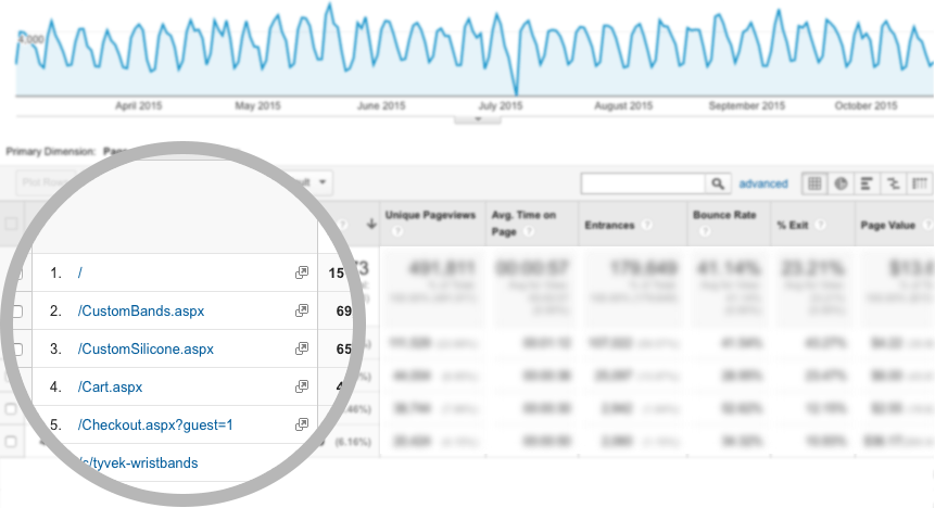
Over 25% of users went directly to Customize Wristbands
Findings
The research brought profound changes to the navigation and flow. We simplified the users choices to two main funnels.
Here's a list of some of the major discoveries:
- Simplify navigation. Through click-tracking and Google Analytics we found almost 80% of the navigation went unused.
- Two choices. The phrasing "In Stock" was misinterpreted for the wristbands actually being in stock and ready to ship. "Premade" and "Ready-Made" were then put up for a vote on UsabilityHub (Ready-Made won by 76%). Users wanted to Customize or quickly buy "Ready-Made" Wristbands and checkout.
- Increase trust. Users weren't interested in the companies history or newsletter. They wanted to know they were real. Seeing a physical location and a modern design increased our trust metric by 27%.
- When will these get here? Shipping and turnaround time was the #1 mentioned concern for buyers. Event organizers wanted to know the last minute they could order. All users asked replied they would return if they knew the timing of such items.
- Customize & Checkout. Through Google Analytics and usability testing we found most users just wanted to choose a few colors, add their logo, and checkout fast.
- New Users. Needed a little handholding. By providing a set of Best Sellers, we're able to calm their concerns. Examples and ratings also helped.
- Which one do I need? Beginner users needed choosing which wristband suited their needs quickly, so a concerted effort was put into making the discovery process as easy as possible. This would end up being the most difficult part of the redesign. Deciding which information was most relevant took multiple iterations and testing.
- Coupons. Wristband initially thought this was a big selling point, but our research found that more strategic and timed placement converted much better. Through timed email campaigns and placement closer to checkout, it helped push interested users over the edge. It also freed up valuable space and minimized visual clutter.
- Price. Most wristband sites show price front-and-center, making the sites feel like a weekly snail mail throwaway. Because it was the ultimate selling point, we knew we needed to find an elegant way to inform the user, without looking cheap or desperate.
- Photography. Last, but not least, all of our test users mentioned photography as one of the main reasons they buy. Wanting to see almost life-like, high-quality photography would be a major investment, but will end up paying for itself in a month or so.
Design, Test, Iterate
Initially, we only applied the findings to the homepage. The new navigation, footer, hero, best sellers, removing featured items, and most importantly, pushing the "Customize" feature front-and-center.
Global Navigation Redesign
Below you can see our design process and the massive simplification of the header based on our research findings. The final version comes after 12 users tests, and is ultimately focused on working seamlessly through mobile and tablet.
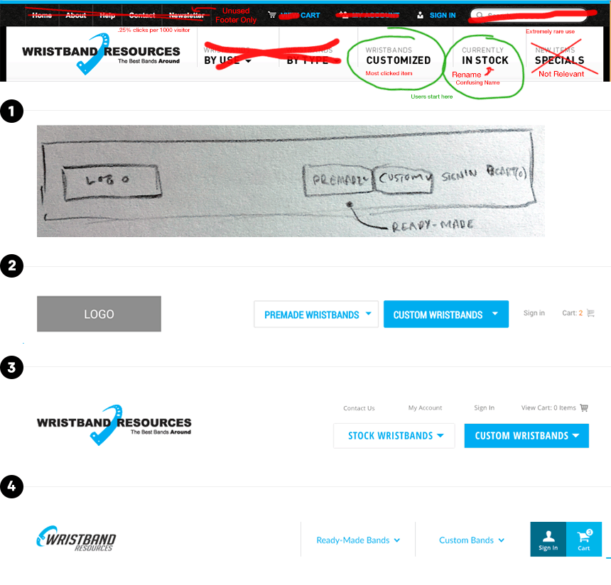
Wristband.com Header Iteration Process
Homepage Redesign Iteration
We then applied the same process to the homepage. Redesigning portions, refining and then testing them with UserTesting.com. Each version becomes more focused, simplified and better suited to the end-users needs and ultimate goals.
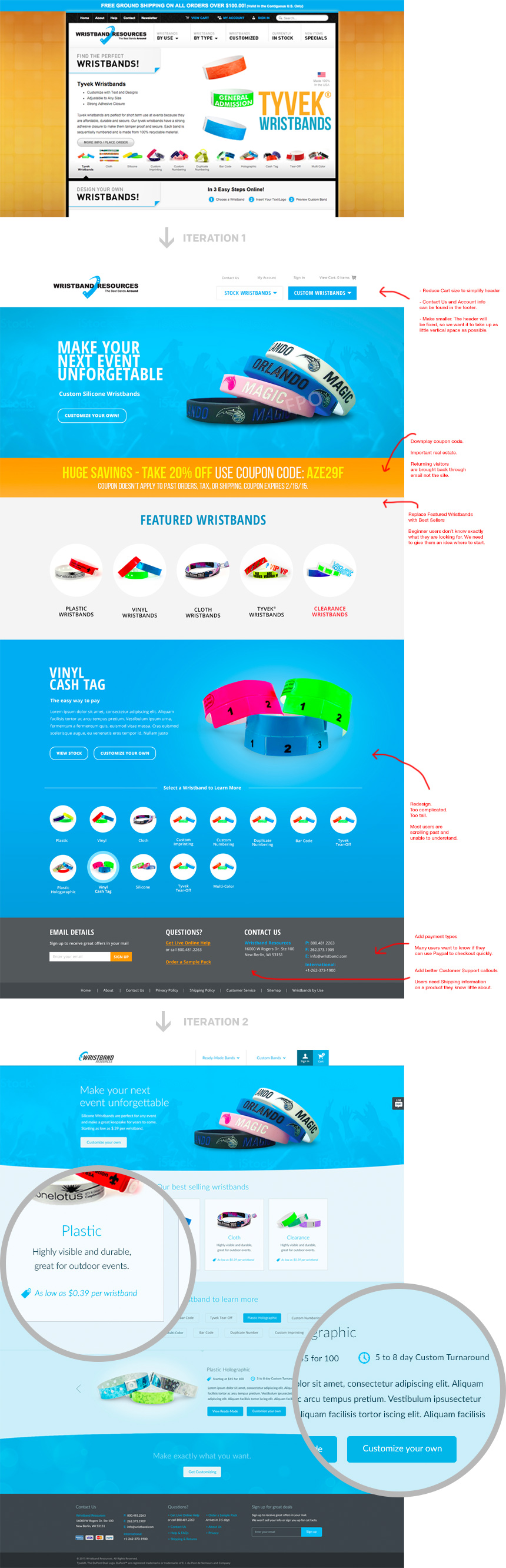
Wristband.com Homepage Redesign Process
Wireframing / Prototyping
The process begins through rapidly creating wireframes based on our findings. Although, we started with a homepage, we've already worked to enhance the checkout experience, refining each through quantitative, data-driven, and task-oriented goal testing.
Conclusion
This process took around 2-weeks and has served as a great example for current and prospective clients. It's a great study in quick iteration through prototyping and testing.
Our findings also suggested that it might be possible to focus the funnel into a "Custom Wristband Configurator" from the very beginning. I wouldn't be surprised to see something similar in the next year or so. Launching Winter 2015.
Thanks for reading!